Friday 6 May 2016

Evaluation 7 - Looking back at your preliminary task, what do you feel you have learnt in the progression from it to the full product?


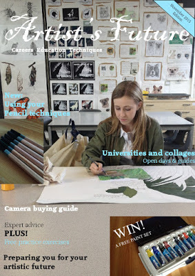
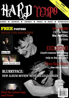
Looking back on my Preliminary Task, the School Magazine that I have created was my first step into making a magazine. I had briefly learnt about the conventions of a magazine but I did not know them in as much depth as I do now and for a first time I didn't think it was too bad. I have also learnt more about the layout and how to make it engaging. In my main task, I was able to spend more time developing, improving and experimenting with my pages. Most importantly, I have learnt how to use a wide range of technologies and software. I was able to receive feedback from others on my final product to make sure it is suitable for my target audience.


Preliminary Task                                               Final Product
 

Monday 25 April 2016

Evaluation 6 - What have you learnt about technologies from the process of constructing this product?


Evaluation 5 - How did you attract/address your audience?


Evaluation 4 - Who would be the audience for your media product?

https://goanimate.com/videos/08h4frWKV_zc?utm_source=linkshare&utm_medium=linkshare&utm_campaign=usercontent

Evaluation 3 - What kind of media institution might distribute your media product and why?

A media institution is a company that owns numerous companies in a range of media such as television, radio, publishing, motion picture, and the Internet. They are responsible for a media text. This could be through marketing, production and distribution. After researching media distributors, I feel Future PLC  is best for my magazine. This is because they already have ‘a range of genres and companies’ of which I have taken inspiration from such as Metal Hammer, Classic Rock, Total Guitar and Revolver. While researching these magazines I found there has been a decrease in their selling, this means there is a gap for my magazine. This company may want to decide between these decreases in sales or publish a new magazine. This is where I feel my media product fits in because I believe this and the fact I have created a modern, and original magazine will help sell my magazine to Future PLC.
Below, I placed mine with the magazines they distribute to show it addresses their target audience as well.


Sunday 24 April 2016

Evaluation 2 - How does your media product represent particular social groups?

I know, from my target audience survey, that they like to listen to music on albums and see live gigs. This is where they would spend their money meaning they wouldn’t want to spend too much.  I kept my price of £2.50 low to attract buyers from competing magazines as well as new buyers. I also didn’t want to make it too cheap as it shows they do spend money on the music industry. Thinking about my cover model, I kept to the usual rock magazine convention of showing anger to the audience. When dressing my model I took inspiration from a large band in the industry called ‘Black Veil Brides’ who use this war paint.
Below shows a range of bands, with my model in the centre, that I took inspiration from. These in particular are who my target audience listen to according to leading rock magazines such as Kerrang! and Metal Hammer.

Friday 22 April 2016

Evaluation 1 - In what ways does your media product use, develop or challenge forms and conventions of real media products?

Firstly, I used original conventions such as a standard A4 size. I did this because if I used A5 for example either the text would be too small or I would be crowding everything together. If it was bigger, such as A3, it would limit who would want to buy it because it's not easily transported and can seem overwhelming.
I challenged a usual convention by using black as my main colour, whereas a convention of other magazines is to use bright bold colours to stand out. Instead of doing this I chose a dark theme of black and red to stand out in a different way to my target audience of rock and metal fans. On the other hand, I used yellow to make attractions such as pugs and puffs stand out against the black on shelves.

Secondly, my Masthead has been constructed with inspiration mainly from Kerrang! The font I used, which according to the creator, is "rock, metal, music". This makes me feel it is suitable for my mast head. It is important to portray the genre through the mast head as it is the first thing that will be read on the shelf. 'Hard Tempo' came from the fact that the magazine is based on heavy music with a fast beat, also known as tempo. It is short and snappy so it is easy to recognise and memorable. Using white makes the title stand out. I chose dark red to make the text resemble anger and blood, and therefore fits my target audience. It also ties in with my cover line colours which I used for the same reason.


The secondary images I used were my own photos I had taken of rock singers or concerts I have been to myself. I used these because they inform the reader of what is featured inside.
For my central image I used a black wall as the background and made sure the model's t-shirt was black as I found, from my survey, black is the best colour for a rock magazine. I made the images black and white so the model, the guitar and design on his t-shirt contrast to the black. They follow stereotypes of rock music through angry expressions, black clothing, electric guitars and sometimes face paint. I made sure his face was centred on the cover so it is clearly seen so he can be recognised by people who like the music; they would feel encouraged to buy it. Another convention that I challenged what the fact of having my barcode on the front whereas others have it on the back to make room for more advertising space. However, my price is an advertising feature to attract buyers as it is relatively cheap compared to others in the industry.

Wednesday 20 April 2016

Double Page Spread

After receiving feedback on my first draft I found the large quote on the left page was covering my models face. I moved it lower over his tshirt to break up the plain black. Furthermore, I made 'Bluryface' bigger to make it eye catching and stand out which with engage their fans.

Friday 18 March 2016

Final cover

Adjustments
After asking my target audience I changed what hey suggested.
After hearing it was too cluttered, I reduced the amount of poster examples on the cover, also replacing them with my own images, and just saying 'free posters' rather than a specific amount. To improve on this point I also put all of the cover lines to the side with red headers rather than one in the middle at the bottom. Secondly, I made the barcode portrait. The final thing they suggested was to make the text on the pug clearer to read to I changed it to a better font this is now simple.
Colour: I asked my target audience what colours they thought were best for a rock magazine and    they said red, black and white. I think this also. I included yellow for the pug and puff so they will stand out against the black more as I found my audience like free items.
Mast Head: The font I used was specifically a gothic, rock font. It is important to portray the genre through the mast head as it is the first thing that will be read on the shelf. 'Hard Tempo' came from the fact that the magazine is based on heavy music with a fast beat, also known as tempo. It is short and snappy so it is easy to recognise and memorable.
Pug: I included a competition on a pug to attract more people. It is yellow to catch your eye however, I put it to the right so the mast head will be read first because we read from left to right.
Language: I thought carefully about the type of language my target audience uses. I included up to date genres such as 'Nu Metal', the latest bands like 'Moose Blood' and short snappy taglines that are simple and quick to read. This is because my target audience is young males, usually they will not use language that is too sophisticated or have a long attention span so I need to attract their attention quickly.
Barcode: I kept the barcode small so it wont take up too much advertising space. On the other hand, I kept it on the front cover as the price is low to attract a wider audience. I also included the issue number so they know what magazine they are buying and can keep up to date with the latest one out.
Cover Lines:
Secondary Images: The secondary images I used were other photos I had taken of my own rock singers or concerts I have been to myself. I used these because they inform the reader of what is featured inside
Cover Image: My central image came out as I planned which was good.  I used a black wall as the background and made sure his t-shirt was black as I found, from my survey, black is the best colour for a rock magazine. I made he images black and white so him, the guitar and design on his t-shirt contrast to the black. They follow stereotypes of rock music through angry expressions, black clothing, electric guitars and sometimes face paint. I made sure his face was centred on the cover so it is clearly seen so he can be recognised by people who like the music, they would feel encouraged to buy them.
Vlog


I wanted to experiment with different medias and thought logging would be a good method of portraying my work. i recorded my day meeting my friend as an example and to play around with the software VideoPad

Friday 22 January 2016

Commercial Media Structural Triangle

Most Media producers of magazines rely on advertising revenue as the majority of their profit. Some have subscriptions available which are a minor income. All magazines, including music, would not be able to continue without advertising.

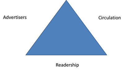
There are three factors that make the business for Media Producers are advertisers, circulation and readership.
Advertisers- companies and features that advertise themselves in your magazine
Circulation- the number of copies distributed based on an average of each issue
Readership- an estimate of how many readers an issue has


Q is a leading music magazine with a circulation of 61,485. Their target audience is an average of 32 year old men in an ABC1 class, this means they would be in a good job so they can afford to pay for the magazine and high quality brands that may want to advertise inside. For this reason, Q's advertising prices are high, for example, it costs £10,072 for a full page FH display. Furthermore, they have a readership of 377,000 meaning a lot of people would be picking up and reading the magazine, this encourages companies to advertise and are prepared to pay their prices.