After designing my magazine cover I needed to ask my target audience for their opinions. I asked each person for positives and negatives so I know what to improve and what to keep. I wanted them to mention conventions such as images, pugs, cover lines, price and most importantly; whether they would buy it.
From this survey, I found there are some small changes I need to make to cover but overall, they all liked the magazine in general which is positive.
Friday, 11 December 2015
Thursday, 10 December 2015
First design of my front cover
The following image shows my first design of my magazine cover. I will get my target audience to review it to see what I can improve on.


Wednesday, 9 December 2015
Cover Image
When I imported my cover image onto my magazine cover I found his face was covered by the cover lines. To stop this from happening I flipped the image so his face was on the other side. I also found it difficult when the original image background was grey, rather than black, to fit it into the cover without looking a separate image. To make it blend in with the rest of the magazine I darkened it slightly so it was black.


New Original

New Original
Photoshoot
After taking the photos for central image I chose these four as the best ones. I wanted the wall as the background and his t-shirt to be black as I found, from my survey, black is the best colour for a rock magazine. I made he images black and white so him, the guitar and design on his t-shirt contrast to the black. The props I used was the guitar and war paint make up.


Tuesday, 24 November 2015
Planning of my photo shoot for my music magazine
When I create my final magazine cover I will be using my own photos that I have taken. I have looked at many rock magazines and seen what is included in their central image, often it is the lead singer of a band. Using this to influence my photo shoot, I will use one person who will be a lead singer of a band I create.
They follow stereotypes of rock music through angry expressions, black clothing, electric guitars and sometimes face paint. I can use all or some of these ideas to create an ideal rock star for my central image.
My cover model will have an angry expression, wearing war paint and holding a guitar because this is how I imagine a rock star to be.
For my photo shoot I will need my fully charged camera which is a Nikon D3200. In case my camera runs out of charge I will use batteries, and my phone camera as a back up. The props that I will need is the make up, clothes and my electric guitar.
For my contents page I will shoot with three other bands in various locations. One of these will be a live photo from a concert I have been to recently called Pierce The Veil.
I may edit my photos in ways such as black and white to improve the aesthetics.
Wednesday, 18 November 2015
Music magazine mock up

This is my mock up of what I plan my music magazine to look like. After analysing the results of my survey, I found people thought the best colours for a rock magazine were black and red. I then used white writing to contrast against the black and the bright yellow pug to stand out. I chose the competition to be yellow to make it stand out and attract a bigger audience.
I used this particular image to get a feel of how mine with look as I am planning to also just use the lead singer of a band.
I also featured a tagline to inform the reader what will be included inside. I places it at the top under the mast head so it can be seen easily on the shelf.
From my survey, I also found that the most popular genres were rock, metal and alternative. I listen to all of these so for my secondary images I chose the most popular bands from each genre to include, this is to attract the fans of these artists.
I included certain language and puffs such as "exclusive!" and "20+ pages" and "latest" so it would seem like the reader is getting more for their money and will find certain things in only this magazine. This will encourage them to want to read on and buy it.
When I make my final magazine I may need to resize or move other text and images around top make it fit.
Tuesday, 10 November 2015
Monday, 9 November 2015
Survey Result Analysis
In my survey I asked the gender of the person. I asked gender rather than sex because socially constructed attributes and roles to that person are more important than their physical characteristics. The gender with help me which colours I use, hobbies and clothing brands I feature. I found most of my audience were male. this means I will use more masculine colours, language and brands.
Next I asked for their age because this will effect the language I use and what I feature inside. I found the largest proportion of my audience was between the ages of 15 and 25.

I asked my target audience what clothing brands they wear. This will help me decide which brands I should advertise inside. If I used clothes my audience didn't like the brand would not sell any clothes and not want to feature. After asking I found Vans was the most popular followed by Topshop and Topman.

To also find out what to feature in my magazine I wanted to find out what they did in their spare time and their hobbies. All of my audience listen to music which is most important. They also spend a lot of their time watching TV and going out. I found that the younger audience, which is most, all use social media. I can use this to my advantage by adding links into my magazine to my magazine's social media pages.

I asked how people listen to there music because I can advertise concerts, CDs and other ways to sell music. I found everyone listens to music on their phones and another popular way is radio especially for the older audience.

One of the most important questions was do you read music magazines and the result was 80% do.
Another important question was what should be featured in the magazine because I need to know what my target audience want to see to buy it. I found news and reviews were most popular followed by tour dates and freebies such as posters. Furthermore, I found the magazines my readers usually buy contain freebies and posters

I thought it was key to ask what my target audience pays for their music magazines because I need to make mine a suitable to their price range. They usually pay between £2.00 and £3.00.

When I am designing my front cover it needs to attract my target audience. A good way I can do this is through though the use of colour. I found that black, white and red on a rock magazine appeal to them.

I wanted to find out how popular advertising tours and the dates in my magazine by finding out how often my readers would go to gigs.

Next I asked for their age because this will effect the language I use and what I feature inside. I found the largest proportion of my audience was between the ages of 15 and 25.


To also find out what to feature in my magazine I wanted to find out what they did in their spare time and their hobbies. All of my audience listen to music which is most important. They also spend a lot of their time watching TV and going out. I found that the younger audience, which is most, all use social media. I can use this to my advantage by adding links into my magazine to my magazine's social media pages.

I asked how people listen to there music because I can advertise concerts, CDs and other ways to sell music. I found everyone listens to music on their phones and another popular way is radio especially for the older audience.

One of the most important questions was do you read music magazines and the result was 80% do.
Another important question was what should be featured in the magazine because I need to know what my target audience want to see to buy it. I found news and reviews were most popular followed by tour dates and freebies such as posters. Furthermore, I found the magazines my readers usually buy contain freebies and posters

I thought it was key to ask what my target audience pays for their music magazines because I need to make mine a suitable to their price range. They usually pay between £2.00 and £3.00.

When I am designing my front cover it needs to attract my target audience. A good way I can do this is through though the use of colour. I found that black, white and red on a rock magazine appeal to them.

I wanted to find out how popular advertising tours and the dates in my magazine by finding out how often my readers would go to gigs.

Wednesday, 4 November 2015
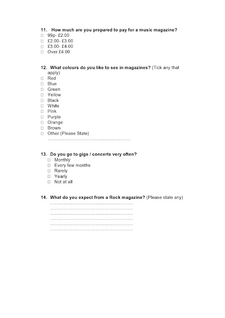
Music Magazine Survey
I created a questionnaire to ask my target audience about their demographic and psychographic profiles. This will help me to create and design my own music magazine, deciding colours, font and many other conventions. It should be non-bias and representative of my target audience so I can understand what they like.


Friday, 23 October 2015
My target audience profile
Andy, aged 19, has a girlfriend, but is not yet married, who is very similar to him with the same interests such as music. Andy is your typical rock music fan. It portrays his image, style, social group, hobbies and language. He is engaging with music 24/7 whether is listening, reading or at a gig. Andy spends half of his spare time at gigs or rock based festival, often with his girlfriend, as he loves the atmosphere and he can relate to the typical type of people there.
His goal in live is to become one of the lead singers of one of his favourite bands who he never missed a tour of. He dreams of having his own dedicated fans, as he is now, enjoying his vocals and guitar skills.
Andy has a well paid, but simple job, so he can afford the concerts and festivals that he passionately lives for. He is not the most active person, spending most of his time socialising. He spends a lot of his time on social media catching up with the latest news on bands he loves.
Lesson on target audiences
Audience Profiles
In today's lesson we looked at typical profiles of our target audience for magazines, focussing on demographic and psychographic profiles. Demographic profiles are quantifiable statistics of the population such as age, gender, job, location, status, education level and income. Psychographic profiles reflect the usual interests, opinions, activities, attitudes and values.
Looking at national readership serveys we learnt about the following social groups:
A- Upper middle class
B- Middle class
C1- Lower middle class
C2- Skilled working class
D- Working class
E- Lowest level class
We did comparisons of two magazines aimed at different audiences particularly on colour and language. I found teen magazines tend to use bright colours and casual language where as a magazine for older women use pale colours and better vocabulary, both being more sophisticated.
Thursday, 15 October 2015
Semiotic analysis of three music magazines

Kerrang is a magazine based on rock an metal music. They have a very wide audience from young females to old males however, this particular magazine is for males due to the bold reds and blacks.


This is another rock magazine I looked as my magazine will be to improve my knowledge.
Monday, 12 October 2015
Analysing
After planning and making my magazine I am pleased with how it came out, however I may change a few things if I did it again. Firstly, after asking the opinions of my target audience (other 6th formers) I found that the font of the mast head was not very clear so this is the first thing I would change. I also found that some of the places I used the light blue font didn't show up very clearly. If I did it again I would need to change the colour such as a darker blue.
Friday, 9 October 2015
My school magazine contents page

The software I used was serif page plus. For my magazine contents page I chose a similar pale blue colour and font as the text on my cover to keep to the same theme. I added a design and pencils to highlight the magazine genre of art to make it more attractive as a contents page is usually plain, simple and boring.
My school magazine final cover

The software I used was serif page plus. I created this school magazine about art careers and tips. I chose this picture of an art student, keeping the background of the artwork, to attract other art students of the same age: in 6th Form.
I used the Blackadder ITC font for my mast head because it is an artistic font that has calligraphy style techniques for those who find it a hobby. I chose for it to be in white to contrast with some of the artwork on the back wall and what the student is wearing. It also stood out more than any other colour.
I chose my text colours to be pale against the colours of the central image. The colours I used are not too vibrant, therefore giving across a more mature, serious message about the magazine contents and who it is aimed at.
I used many conventions of a typical magazine for advertising techniques, such as the pug in the top right corner. My tagline, attached to my mast head, summarises the genre of my magazine and who it might be aimed at.
I have included many cover lines across my cover to tell the reader what is inside and the articles they will find.
Furthermore, I used a puff to draw attention to the magazine. The two secondary images I used link to the text and contents of the magazine. These will help to sell my magazine.
Wednesday, 7 October 2015
Altering my cover photo
When I took my image, I found the exposure was too low so I used serif photoplus to lighten it. I did this because it was too dark for a magazine cover, also any dark writing I plan to use would not stand out.
This was my original image:

This is my new image that I have lightened:

Tuesday, 6 October 2015
Planning my school magazine photoshoot
My school magazine will be based or art and photography and aimed at 6th formers. It will inform them about future careers, tips and ideas. The central image is important because it will need to attract art students. I plan the central image to be a mid-shot of a 6th from working on their artwork. In the background of the photo, behind the student will be the wall of the art room. This is because it has the artwork of other 6th form students, this will engage an interest towards my target market.
They will be wearing their own clothes as 6th formers do and holding a pencil or paintbrush while working on their work at a school desk.
I will include some secondary images such as artist equipment, for example: paints, paintbrushes and pencils. The purpose of these images is to promote what features inside the magazine. The images I use will link to what is inside because I will include tips with this equipment.
I will use either my phone camera or my Nikon camera
Monday, 28 September 2015
School magazine annotation

Saturday, 26 September 2015
Deconstruction of Heat magazine
In today's lesson we looked at heat magazine which is a weekly magazine based on celebrity gossip. The magazine focuses on the lives of celebrities, usually women, and exploit their privacy. They will present women as an object to men or a negative light to entertain their target audience. The target audience is mainly women aged 18-35 because women this age are usually interested in celebrity gossip.
They use techniques to attract their target audience. Heat magazine uses bright, primary colours to attract the eye of the reader. They also use a lot of secondary images to inform the reader of what is inside and attract audiences who have an interest in them. The images tend to have anchorage near to attract and engage the audience that links to the picture.
The mast head is big, bold and at the top of the magazine to is can be seen easily on the shelf. The font with the rounded letters is also appealing to the female side.

Thursday, 24 September 2015
Non music magazine annotation


Thursday, 17 September 2015
Conventions of a magazine front cover
The front covers of magazines contain many conventions and techniques that are all used to sell the magazine.
The first convention of a magazine cover is the mast head. This is the name of the magazine which is always at the top. For example:

Secondly, there is a tagline that goes near the master head and is often attached to it. It shows what the magazine is about or who it might be aimed at. An example is the 'new music first' under the master head 'Rocksound'

Thirdly, another technique is an anchorage. This focuses on how the image is referred to. this can be through captions, cover lines, articles or headlines. In this magazine, the image is of a band called Black Veil Brides, this name is written boldly on the front to attract the audience who would be fans.

One of the most important conventions of a magazine is the central image. This is because it will catch the reader's eye before they see anything else. It should be relevant to the magazine's purpose and audience. For example: a celebrity. In this magazine, the central image is a famous band.
Some magazines feature a model. This may be a celebrity or a well- known individual connected with the magazine's genre.
Secondary images may be used on the front cover to help promote what else features inside. This magazine has smaller images along the bottom to show which bands are written about inside. this will attract a wider audience of their fans who will want to read about them.
Cover lines are located in various places on the front cover to tell the readers about the content, specifically the articles they will find.
The mode of address refers to the way the magazine communicates with their readers. Some will use a direct mode of address to individual readers through 2nd person pronouns such as "you" or "you are".
A puff is a device which helps to draw attention to certain elements in the magazine. they are often on top of colourful backgrounds or shaped to make them stand out. These are used to promote things such as competitions, free or exclusive things.
Pugs are placed on the top left or right corners of the front cover. They usually show a promotion for that particular edition of the magazine. furthermore, they can be used to show the price if the cost of the magazine is a promotion.
Barcodes, the price and the edition number are plain features that need to be statically placed. The barcode should not cover any important features and the price is usually next to it.

The use of colour is extremely important, creating a great effect. Some magazines have colour schemes, but these can altar from issue to issue.
Front covers will often use a variety of font styles which will often include a meaning to what they say.
The first convention of a magazine cover is the mast head. This is the name of the magazine which is always at the top. For example:

Secondly, there is a tagline that goes near the master head and is often attached to it. It shows what the magazine is about or who it might be aimed at. An example is the 'new music first' under the master head 'Rocksound'
Thirdly, another technique is an anchorage. This focuses on how the image is referred to. this can be through captions, cover lines, articles or headlines. In this magazine, the image is of a band called Black Veil Brides, this name is written boldly on the front to attract the audience who would be fans.
One of the most important conventions of a magazine is the central image. This is because it will catch the reader's eye before they see anything else. It should be relevant to the magazine's purpose and audience. For example: a celebrity. In this magazine, the central image is a famous band.
Some magazines feature a model. This may be a celebrity or a well- known individual connected with the magazine's genre.
Secondary images may be used on the front cover to help promote what else features inside. This magazine has smaller images along the bottom to show which bands are written about inside. this will attract a wider audience of their fans who will want to read about them.
Cover lines are located in various places on the front cover to tell the readers about the content, specifically the articles they will find.
The mode of address refers to the way the magazine communicates with their readers. Some will use a direct mode of address to individual readers through 2nd person pronouns such as "you" or "you are".
A puff is a device which helps to draw attention to certain elements in the magazine. they are often on top of colourful backgrounds or shaped to make them stand out. These are used to promote things such as competitions, free or exclusive things.
Pugs are placed on the top left or right corners of the front cover. They usually show a promotion for that particular edition of the magazine. furthermore, they can be used to show the price if the cost of the magazine is a promotion.
Barcodes, the price and the edition number are plain features that need to be statically placed. The barcode should not cover any important features and the price is usually next to it.

The use of colour is extremely important, creating a great effect. Some magazines have colour schemes, but these can altar from issue to issue.
Front covers will often use a variety of font styles which will often include a meaning to what they say.
Monday, 14 September 2015
My First Post
This is my first blog using Blogger. I will be using this for my media studies coursework in A Level class.


Subscribe to:
Posts (Atom)